King County Metro Trip Planner
App Redesign
For my first collaborative UX project, my General Assembly team was tasked with redesigning a portion of the King County Metro Trip Planner app.
My Role: UX Researcher
Team of 3
Project Length: 2 Weeks
Skills Used: User Research, User Surveys, User Interviews, Usability Testing, Heuristic Evaluation, Contextual Inquiry
The Problem:
Public transit riders want to reach their destinations with as little hassle as possible, but the lack of straightforward tools for searching for destinations, as well as planning and saving future routes, can lead to stress, frustration, and unexpected delays.
The Solution
A straightforward, easy-to-use app that allows for transit newbies and veterans alike to comfortably plan and navigate public transit in real-time by expanding search parameters, and allowing for saving favorite locations and planned routes.
Initial Analysis: App Store Reviews

From the app's low rating in the iOS App Store, I could already see that we had our work cut out for us. The criticism was plentiful and varied, so I affinity mapped the information to find what real users thought most needed fixing.
Review Trends
Entering destination requires an exact address-At least ¼ of reviewers complained that the address field required too much specific information, and while you can search for parks and landmarks by name, a glaring gap in usability is that you can’t search for destinations by business name.
Doesn’t prioritize the fastest or easiest route-Users also complained that the app didn’t always provide the fastest or most efficient route, sometimes turning what should have been a short commute into an hours-long misadventure.
Not reliable-The word “unreliable” popped up frequently.
Difficult to save information-Many complained that it was hard to save to favorites and to find the favorites menu.
Contextual Inquiry
With the assistance of my team, I conducted a contextual inquiry with three users to observe the current app in action. I wrote a scenario asking users to first navigate from their homes to the Washington Park Arboretum, then from there to the General Assembly campus in downtown Seattle.
This scenario tested: trips with multiple stops and searching based on exact address, landmark name, and business name.
Most executed the first step without too much trouble, since it required a specific home address and the name of a popular landmark, but it was the last leg of the task that was the most difficult, and the most enlightening.
The app did not allow for searching by the name of a business, which meant the user would already have to know the specific address, intersection, or bus stop of their destination, which most won’t know offhand. In fact, the person who completed the task the fastest works at the General Assembly front desk, so he happened to know the address offhand. Another user found the route by entering the intersection of 3rd Ave and University St, and another user abandoned the task completely after making several attempts to find the GA offices in the trip planner system.

User Survey
To get familiar with the King County Metro user base, I formed an initial screener survey to assess the public's habits and needs surrounding public transit.
From 20 responses:

Note: Considering the limited time and relatively small number of responses received, it is entirely possible that this is not a completely accurate representation of the "typical" transit user. Had I been able to spend more time on this project, extensive surveying efforts would have been a high priority.


User Interviews
The synthesized survey results gave me a proto-persona to work with, and interviewed 8 women that closely matched that set of characteristics. I asked them for more in-depth information about their habits and knowledge surrounding the use of public transit, as well as their positive and negative experiences, and what would make transit planning easier for them.
Affinity Mapping
& Feature Prioritization
Our project manager and I then affinity mapped the insights gleaned from these eight interviews. The majority of user insights fell into categories we named “Real-Time Updates”, “Planning & Scheduling”, and “Route Options.” This helped greatly with the task of prioritizing the features we'd be focusing on, as well as providing more information to help the persona come to life. We decided to focus on smoothing out the base-level functions that get users from A to B, and add a feature that allows users to plan ahead and save their routes.


User Persona

The vast majority of the persona details came directly from survey & interview data, but I expanded the information a bit to make Chloe feel more real, and all of the added details fit logically with the information given. For example:
-
Attending UW - The majority of those surveyed were students, and this is the largest university in the area, and her average age fit well within a common age range for graduate students.
-
Her home in Beacon Hill, Seattle - Many students live in South Seattle, since it's less expensive than the area around the university, but still an easily commutable distance from UW. This also meant that the persona would have to take both of the most popular transit services used by those surveyed (King County Metro and Sound Transit).
-
Fear of getting lost - Many of those interviewed were new to Seattle, and were most interested in planning their trips ahead of time to ease anxiety about getting lost.
Usability Testing
There were a total of 6 iterations of wireframes, and most changes were relatively small between versions, but made a huge difference in usability scoring. Below are some examples of changes made based on user feedback for the app's four main screens.
(Wires, mockups, gifs, and clickable prototype designed by our team's visual/interaction designer)
The scenario I wrote for our testers asked them to make Chloe's commute to school for the next day, planning to arrive at the Burke Museum (a landmark near her classes) by 8:30 AM, then save the route for later.
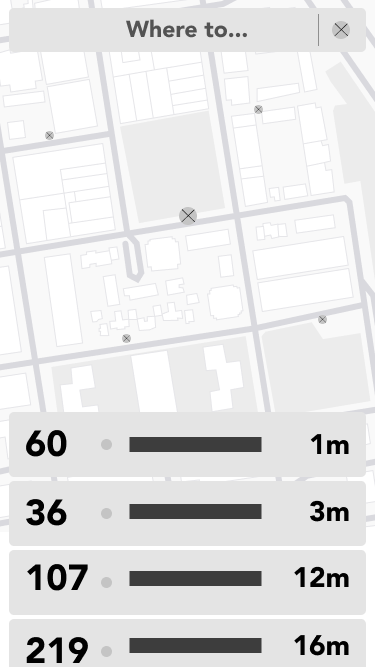
Home
The home screen shows stops and busses near the user's location. We realized early on that we needed to raise the fidelity bit by bit, as there was too little information for users to go by to confidently complete the testing scenario. Based on user feedback, our interaction changed x's to little bus icons, and added text to indicate what the stops listed below meant. We also changed the bus numbers to match busses that run in the area where Chloe lives.
Trip Planner
The ability to plan ahead was crucial to our user, Chloe, and the process began here on the trip planner page.. This was another exercise in gradually raising fidelity. The biggest changes based on user feedback can be seen in the "depart" and "arrive" settings. Because our user needs to plan ahead, we needed to make sure these functions were absolutely clear, leading our interaction designer to expand to show both "depart" and "arrive" options, add language clarity, and visually distinguish them from the menu below so that they'd be harder to miss. He also gradually increased the fidelity of the nearby route options below (which default to the "depart now" results) so that our testers could better understand what this information represented.


Toggling Travel Times
Our user Chloe needed to reach her destination by a certain time, so we needed to make sure the language was clear (I tested the UX writing of the depart at/arrive by labels as well) . These changes were more gradual, our interaction designer fine-tuning these bits based on user feedback.
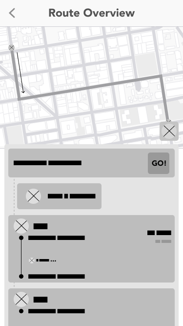
Routes
Probably the starkest transition fidelity-wise of any page in our redesign, our testers indicated that they needed a LOT more information before they could really grasp what the page was trying to tell them, and where they needed to go from there. Our interaction designer added bus numbers, icons, and directions, so that our testers could know what information they needed to confirm, and what exactly they were saving. The 'save for later' function, indicated by the star icon, was moved closer to the route info, and given a higher contrast so it was easier to spot. A confirmation message was also added, to clarify that the route had indeed been saved, and that the full set of tasks had been completed successfully.
Final Clickable Prototype
Results

Our team asked each tester to fill out a System Usability Scale (SUS) evaluation score sheet, which evaluates usability on a 100-point scale. The average score for the original app was 55/100, and we're proud to have raised the score to 88.13 in our final, full-color mockups.
Benchmark SUS scores: the app as it is now, our 2nd iteration wireframes, our final wireframes, and our full-color mockup.
"As a metro user, I friggin' love this thing!"
-DC, usability tester
Next Steps

Were we able to take this project further, the next steps would be to add real-time updates for transit information, to allow users to plan for multiple trip stops, and to complete more extensive and in-depth user surveying and interviewing for a more whole and accurate representation of King County Metro's typical user.
Other Projects:


